
How to Read Candlestick Charts: Crypto Trading 2026
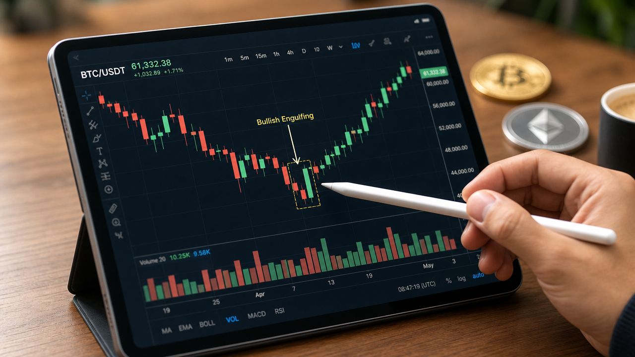
You're probably looking at a Bitcoin or Ethereum chart right now, watching green and red candles print in real time, and thinking the same thing most traders think early on: I can see the moves, but I can't read the story.
That's the underlying problem. Candlestick charts aren't hard because the shapes are complicated. They're hard because beginners get taught to memorize names instead of interpret context. A hammer, doji, or engulfing candle means very little on its own. In crypto, where momentum can shift fast across spot, futures, DeFi tokens, and newer Web3 narratives, isolated patterns get traders trapped.
The useful skill is understanding how to read candlestick charts as market language. You're not trying to collect patterns like flashcards. You're learning how buyers and sellers behaved during one period, how that behavior changed over several periods, and whether that change matters at a level that institutions, whales, and active retail traders are watching.
If you want an extra primer while working through this guide, Alpha Scala's piece on understanding candlestick charts is a solid companion read. For the broader execution side, it also helps to study practical crypto trading strategies so candles don't stay disconnected from entries, exits, and risk.
Table of Contents
- From Crypto Chart Chaos to Clear Signals
- Decoding the Anatomy of a Candlestick
- Essential Single-Candle Storylines
- Powerful Multi-Candle Patterns and Momentum Shifts
- Context Is Everything The Trader's Triple-Check Framework
- Putting It All Together A Crypto Trade Walkthrough
From Crypto Chart Chaos to Clear Signals
Open any major exchange, switch from line view to candlesticks, and the chart suddenly looks alive. Every bar becomes a fight. On a fast-moving crypto pair, that can feel like progress for about thirty seconds, then the noise takes over.
That's where most traders start making bad decisions. They see one dramatic green candle and chase. They see one ugly rejection wick and panic sell. In live markets, especially around Bitcoin ETF headlines, Layer 2 token rotations, DeFi liquidity moves, AI-linked token narratives, or real-world asset tokenization buzz, one candle rarely tells the full truth.
The difference between guessing and reading
Strong chart reading starts with a simple shift in mindset:
- Don't memorize shapes first: Learn what each candle says about control.
- Don't isolate the signal: Read it inside the broader trend.
- Don't ignore market structure: Support, resistance, and liquidity still matter more than pattern names.
- Don't skip risk: A clean chart read without a trade plan still loses money.
A candlestick chart is useful because it compresses behavior. You can read panic, exhaustion, acceptance, rejection, and momentum transfer faster than you can on a simple line chart. That matters in crypto because narratives move across sectors quickly. A breakout in Ethereum can spill into Layer 2 ecosystems. A sharp move in Bitcoin can drain attention from altcoins. DeFi rotations can distort chart structure on lower timeframes. Candles help you see those transitions while they're happening.
Practical rule: A candle pattern isn't a trade. It's evidence. You still need a reason, a location, and confirmation.
What actually works in volatile markets
The traders who improve fastest usually stop asking, “What pattern is this?” and start asking, “Who just lost control here?”
That single question cleans up a lot of confusion. It also stops you from treating technical analysis like a superstition. In crypto, where smart contracts, tokenomics, perpetual funding, and liquidity pockets can all influence price action, candles work best as a decision tool, not a prediction machine.
Decoding the Anatomy of a Candlestick
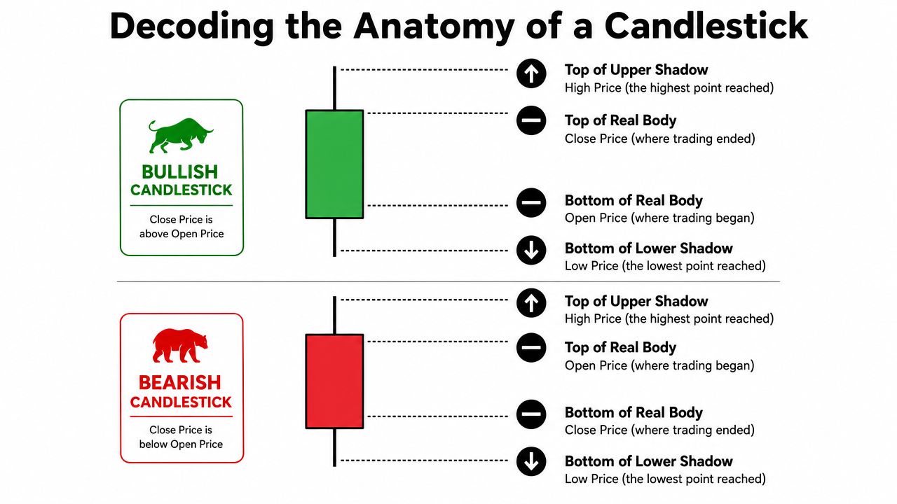
Candlestick charts were pioneered by Japanese rice trader Munehisa Homma in the 1700s. Each candle represents Open, High, Low, and Close for a defined time interval, and green candles show Close > Open while red candles show Close < Open, which makes market sentiment far easier to read at a glance, as explained in Domo's overview of candlestick chart structure and history.
Why one candle matters
A single candle is a summary of one battle between buyers and sellers. That battle might represent one minute on a scalping chart, four hours on a swing chart, or one day on a positional setup. The structure stays the same. Only the timeframe changes.
Each candlestick encapsulates the four OHLC points, with the body showing the open-to-close range and the wicks marking the period's extremes. Coin Bureau's guide on crypto candlestick charts and OHLC data is worth reviewing if you want to connect candle structure to the broader idea of price discovery.
What the body and wicks tell you
Once you know the parts, the chart starts speaking clearly.
| Part | What it shows | What traders infer |
|---|---|---|
| Open | Where the period began | The starting reference for control |
| Close | Where the period ended | Who finished stronger |
| High | The highest traded price | How far buyers pushed |
| Low | The lowest traded price | How far sellers pushed |
The real body is the most important visual element. A large body shows decisive movement from open to close. A small body shows hesitation or balance.
The wicks, also called shadows, show what happened beyond the open and close. If a candle has a long upper wick, buyers pushed price higher but couldn't hold that territory. If it has a long lower wick, sellers forced price down but buyers clawed back enough ground before the close.
That's why candlesticks still work so well in crypto. They condense noise into something readable. Whether you're analyzing Bitcoin, a DeFi governance token, an AI-related crypto asset, or a Layer 2 project with strong tokenomics, the candle gives you a fast behavioral summary.
- Green candle: Buyers controlled that period.
- Red candle: Sellers controlled that period.
- Long body: One side won with force.
- Long wick: One side tried to win but got rejected.
- Small body: Neither side had conviction by the close.
Read candles as actions, not decorations. The chart becomes much easier once every wick and body means something concrete.
Essential Single-Candle Storylines
A single green candle in crypto means the close finished above the open, which signals upward momentum and buyer control for that timeframe. A red candle means the close finished below the open, which signals seller dominance, as summarized in Changelly's breakdown of bullish and bearish crypto candles.
Beginners often stop there. Professionals don't. One candle can tell you whether a move was confident, fragile, rejected, or exhausted. That's why the best way to learn how to read candlestick charts is to treat patterns like short stories of pressure and response.
The hammer and shooting star
A hammer tells a very specific story. Sellers drove price lower during the period. Then buyers stepped in hard enough to force price back near the open or above it by the close. The long lower wick is the evidence. Sellers had control early. They lost it later.
That's why a hammer can matter so much after a selloff. It shows rejection of lower prices. But if you trade every hammer you see, you'll donate money to the market. The pattern becomes useful only when the location supports the story.
A shooting star is the mirror image. Buyers pushed price up, often aggressively, then sellers took control and forced the close back down near the lower part of the candle. The upper wick shows failed continuation. In practical terms, the market probed higher prices and rejected them.
For trade management, that rejection matters because wick highs and lows often become logical invalidation points. A clean setup still needs discipline. Many traders thus benefit from a tighter process around setting stop losses in crypto trading.
The doji and marubozu
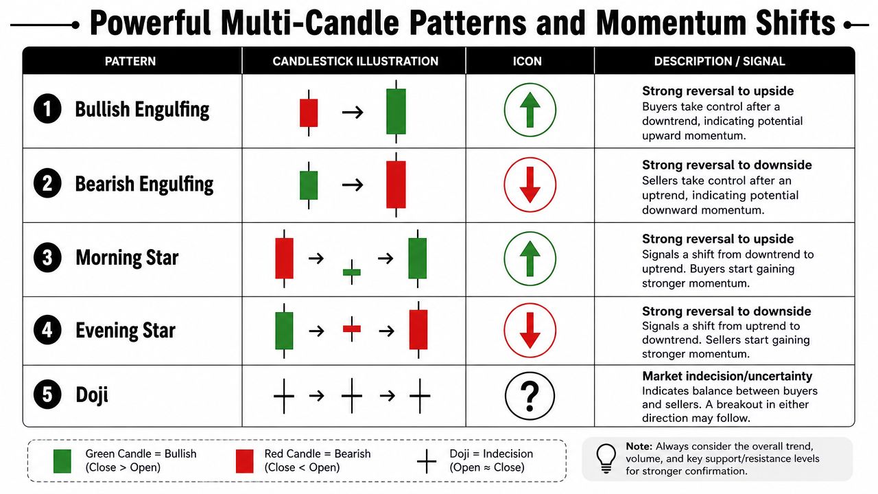
A doji is indecision on display. The open and close sit very close together, which means neither buyers nor sellers established clear control by the end of the period. On its own, a doji doesn't tell you what happens next. It tells you the current move may be losing certainty.
That's useful in fast crypto environments. During heavy rotation between meme coins, DeFi sectors, GameFi names, and newer Web3 narratives, a doji often appears when traders are reassessing whether price deserves to keep moving in the same direction.
A marubozu sits on the opposite end of the spectrum. It has a strong body and little to no wick. That's conviction. Buyers or sellers controlled the period from near start to finish with minimal rejection.
Use these single-candle storylines like this:
- Hammer: Failed downside pressure, possible bullish rejection.
- Shooting star: Failed upside pressure, possible bearish rejection.
- Doji: Balance, hesitation, or exhaustion.
- Marubozu: Strong directional conviction with little pushback.
Most losing trades start with a trader falling in love with a candle and ignoring the surrounding market structure.
That's the trap. A hammer in the middle of nowhere is just a shape. A doji after a strong move can matter, or it can mean nothing. A marubozu can launch a trend, or it can be the last burst before a reversal if the move is already stretched.
Powerful Multi-Candle Patterns and Momentum Shifts
A single candle can hint at stress. A multi-candle pattern shows who won the fight.
That distinction matters in crypto because one strong candle can be short covering, liquidation noise, or a brief reaction to headlines. A sequence has more value because it shows pressure, response, and follow-through. Even then, the pattern only matters if it forms in the right place. That is the contextual paradox beginners miss. The shape looks the same, but the odds change fast based on trend, nearby levels, and participation.
When two candles change control
The bullish engulfing pattern is one of the clearest examples of momentum shifting hands. Price opens weak, sellers press, then buyers take back the entire prior candle and close with authority. In practice, that tells you buyers were willing to absorb offers and force late sellers out of position.
The bearish engulfing pattern tells the opposite story. Buyers push first, then sellers hit back hard enough to wipe out that progress and close through it.
Two other two-candle reversals deserve attention:
- Piercing line: A bearish candle is followed by a bullish candle that closes deep into the prior body.
- Dark cloud cover: A bullish candle is followed by a bearish candle that closes deep into the prior body.
These patterns matter because they reveal a real fight around order flow. They show one side stepping in hard enough to absorb the other side and reverse the short-term auction, which ties directly to the liquidity of cryptocurrency and why some reversals hold while others fail within minutes.
Three-candle sequences traders respect
Three-candle patterns carry more weight because they show continuation after the first shove. That extra confirmation helps in crypto, where the first reaction is often the trap and the second or third candle tells you whether fresh money is still coming in.
According to IG's guide to candlestick patterns and trading confirmation, patterns are more reliable when they form around support or resistance instead of drifting in the middle of a range. That lines up with what works on live charts. A clean setup in a bad location still fails a lot.
The three-candle formations I keep on the watchlist are:
- Three White Soldiers: Three strong bullish candles closing progressively higher. Buyers keep control instead of giving back the first impulse.
- Three Black Crows: Three bearish candles stepping lower. Sellers stay aggressive and rallies get sold quickly.
- Morning Star: A bearish candle, then hesitation, then a strong bullish reclaim. It can mark a real turn after downside pressure.
- Evening Star: A bullish candle, then hesitation, then bearish follow-through. It often shows buyers losing control near a local peak.
Use these patterns as evidence, not as triggers by themselves. A morning star printed into overhead resistance after an exhausted bounce is often just a pause. Three white soldiers after a breakout and expanding participation can be the start of a move worth staying with.
That is the part beginner guides usually miss. Multi-candle patterns do not have fixed meaning. They gain meaning from where they appear and who is trapped when they appear.
Context Is Everything The Trader's Triple-Check Framework
Most beginner guides teach patterns as if they work in a vacuum. That's one of the fastest ways to misread a chart.

The critical idea is the Contextual Paradox. The same pattern can point to very different outcomes depending on trend and placement. Dukascopy puts it plainly in its article on how trend context changes candlestick meaning: “the same candlestick pattern can mean completely different things depending on where it appears in the larger trend.” That's why a doji in an uptrend can suggest exhaustion, while a doji in a downtrend can suggest potential reversal.
Trend changes the meaning
Start with the higher timeframe trend. If the daily chart is making higher highs and higher lows, a bullish pattern on the four-hour chart is working with structure. If the higher timeframe is in a clear downtrend, that same bullish pattern may only produce a short-lived bounce.
Many traders in crypto get chopped up. They try to long every small reversal while the larger trend is still pressing down. Or they short every local rejection while the broader market is still in a healthy advance.
A simple framework helps:
- Check the trend first. Is price generally advancing, declining, or ranging?
- Decide whether the candle confirms or fights that backdrop.
- Downgrade standalone countertrend signals. They can work, but they need stronger confirmation.
A pattern against the prevailing trend needs more proof. A pattern with the trend needs less, but it still needs the right location.
Location and volume decide whether the signal matters
Location is the next filter. A hammer at a meaningful support zone carries a different message than a hammer in the middle of a noisy range. A bearish engulfing candle at resistance tells a more credible story than one that appears in open space.
TradeZero's guide explains this well in its discussion of support, resistance, the 3-candle rule, and volume confirmation. It states that waiting for three confirming candles can reduce false signals by up to 40%, that a pattern aligned with key levels can see reliability rise by 50-60%, and that a bullish engulfing pattern on twice the average daily volume is much stronger than one on weak volume.
Volume is the third filter. Candles show shape. Volume shows commitment. A reversal candle on heavy volume tells you many participants agreed with that rejection or reclaim. On low volume, the same candle can be a weak bounce inside thin liquidity.
This triple-check framework works across crypto sectors:
- Bitcoin and Ethereum: Better for clean structure and widely watched levels.
- Layer 2 and DeFi tokens: Often react sharply around narrative-driven levels.
- RWA and AI-linked tokens: Can produce violent candle signals that need stronger volume confirmation.
- Low-liquidity altcoins: Require extra caution because slippage and thin books distort candle quality.
That last point matters more than many traders realize. A pattern can look textbook on the chart and still execute badly if the book is thin. If you trade smaller caps or newer pairs, it's worth understanding what slippage in trading does to entries and exits.
Putting It All Together A Crypto Trade Walkthrough
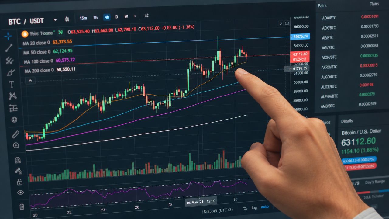
Let's put this into a realistic crypto setup. Assume you're watching ETH after a pullback inside a broader uptrend. The daily structure still looks constructive, and the market has been rotating between majors, DeFi names, and Layer 2 tokens without fully breaking down.
A practical BTC or ETH setup
Price pulls back into a prior support zone that had already acted as resistance before the breakout. That's the kind of location professionals care about because it has memory. You switch to the four-hour chart and wait.
The first candle into support is still bearish. No trade.
The next candle prints a long lower wick and closes stronger. That gets your attention, but it still isn't enough. A lot of beginners jump here because the candle looks like a hammer. We don't buy looks. We buy evidence.
Then the next candle closes bullish and reclaims part of the prior bearish range. Volume is stronger than it was during the weakest part of the pullback. Now the story changes. Sellers pushed into support and couldn't hold the breakdown. Buyers responded where they needed to.
That's a workable setup because it satisfies the checklist:
- Trend: The higher timeframe still favors the upside.
- Location: The reaction happened at a known support zone.
- Confirmation: Buyers followed the rejection instead of disappearing immediately.
- Volume: Participation supports the reversal idea rather than undermining it.
How the trade gets managed
Entry usually makes sense after confirmation, not during the first sign of hope. A logical invalidation sits below the rejection low because if price breaks that level cleanly, the setup's core idea is wrong.
As the trade develops, watch for momentum loss. Traders often spot it through three signs: shrinking candle bodies, wick elongation, and a color change after a run of same-color candles, as described in this video explanation of reversal warning signs. Those clues don't always mean “exit now,” but they do tell you momentum may be fading.
Here's a useful video if you want to compare your chart-reading process with another trader's walkthrough:
Once price moves in your favor, the job changes. You're no longer trying to prove the entry was smart. You're managing risk and extracting value from a developing move.
Here's a practical approach:
- If candles expand with direction: Stay patient. Momentum is still healthy.
- If bodies start shrinking: Tighten attention. The move may be tiring.
- If upper wicks increase into resistance on a long: Buyers may be losing urgency.
- If a color flip appears after a strong sequence: Prepare for either a pause or a reversal.
Good trade management often matters more than perfect pattern recognition.
This is also where a risk-reward calculator helps. If you want a cleaner way to size setups and improve trading P&L, use one before you enter, not after the trade starts moving. The best chart read in the world won't save sloppy sizing.
Candlestick reading is valuable because it sharpens timing. It doesn't remove uncertainty. In crypto, that distinction matters. Markets tied to DeFi growth, Web3 adoption, AI integrations, smart contract ecosystems, tokenomics changes, and Layer 2 expansion will keep producing volatility. Candles help you interpret that volatility with discipline instead of emotion.
If you want more practical crypto analysis like this, follow Coiner Blog for clear guides on trading, blockchain trends, DeFi, Web3, and the risk management skills that keep you in the game.